How to tame your IELTS pie charts

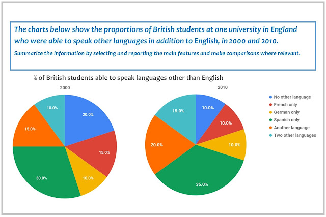
IELTS line graphs are easy to tame - you just go chronologically, so the description doesn't get out of hand. Information in pie charts, however, can be hard to organize because there are different directions you can go in. In this post, I want to share two IELTS pie chart answers I wrote for the same task. The task is from Cambridge IELTS 11 . The introduction and the overview are the same. As you read, pay attention to the organization and try to decide which description works better. ✼✼✼ Introduction The pie charts compare the percentage of British students of one English university who knew foreign languages in 2000 and 2010. Main Body Version 1 The percentage of students in three groups grew. Speakers of Spanish formed the largest share in both years, rising by 5% from 30% to 35%. The increase was the same in the “Another language” and “Two other languages” groups. In 2010, the former amounted to 20%, while the latter comprised 15%, making up the second and third largest prop...
