How to tame your IELTS pie charts
IELTS line graphs are easy to tame - you just go chronologically, so the description doesn't get out of hand. Information in pie charts, however, can be hard to organize because there are different directions you can go in. In this post, I want to share two IELTS pie chart answers I wrote for the same task.
The task is from Cambridge IELTS 11. The introduction and the overview are the same. As you read, pay attention to the organization and try to decide which description works better.
✼✼✼
Introduction
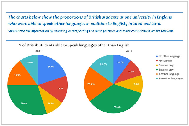
The pie charts compare the percentage of British students of one English university who knew foreign languages in 2000 and 2010.
Main Body Version 1
The percentage of students in three groups grew. Speakers of Spanish formed the largest share in both years, rising by 5% from 30% to 35%. The increase was the same in the “Another language” and “Two other languages” groups. In 2010, the former amounted to 20%, while the latter comprised 15%, making up the second and third largest proportions respectively.
Two groups showed a decline. The percentage of students who could not speak another language decreased from 20%, which was the second largest figure in 2000, to 10%, becoming one of three smallest groups. French speakers showed a 5% decrease, with the figure falling to 10% as well. Students who knew German accounted for 10% in both years, being the only group that did not demonstrate change.
Main Body Version 2
In 2000, speakers of Spanish formed the largest group, with 30%. While the percentage of students who could speak no other language was the second highest, accounting for 20%, the third largest figure was shared by French and Another language, which amounted to 15% each. The two lowest proportions were made up by people who spoke German and Two other languages (10% for each group).
In 2010, all the figures changed except that for Germany, which remained at 10%. The percentage of people who could speak Spanish, Another language, or Two other languages increased by 5%, comprising 35%, 20%, and 15% respectively and representing three largest groups. The remaining two groups, French and No other language, showed a decline to 10%.
Overview
Overall, speakers of Spanish formed the largest proportion in both years. While the figures for French and No other language decreased, those for Spanish, Another language, and Two other languages increased. The percentage of students who knew German was the only figure that remained the same, being the lowest along with Two other languages in 2000 and French and No other language in 2010.
✼✼✼
The first answer is organized by trend, while the the second one is organized by year. Which one is correct? Most people who read these descriptions had a hard time choosing the one that is significantly better. Both are good. The first one is probably slightly better because it contains more analysis. But this doesn't make the second one wrong.
In IELTS, just like in life, there is more than one way to peel an apple. Choose one direction and stick to it. This is how you tame your IELTS pie charts.
PS: If you still need to tame your line graphs, click this link to check out my step-by-step guide.
Btw, I post a lot of my sample answers for both IELTS Writing task 1 and task 2 (plus explanations) on VK Donut https://vk.com/donut/iralutse. Subscribe to get access to unique, top quality IELTS writing material - all written by me personally: IELTS 9, Writing 8.5 two times, proven by certificates.


Nice
ReplyDelete