A step-by-step guide to IELTS line graphs
IELTS Academic Writing Task 1 poses the biggest difficulty to everyone, including those who have excellent English skills. The reason might be that most people don’t often describe graphs in English or even in their native language. I know all the test takers want a simple model to follow. More often than not, they go online and end up trying to follow questionable models. I want to put a stop to this. In this post, I want to share my sample answer and my six-step guide to describing IELTS line graphs.
Disclaimer
While I believe my guide is a good model to follow, you have to keep in mind that:
1) This is one possible approach, not the only one possible approach;
2) Each line graph is different, so the approach might have to be modified for some line graphs;
3) My overall IELTS score is 9, but my writing score is 8.5, so my sample answer might not be absolutely perfect.
Here is the task and the line graph I will be describing. It is based on a task from Cambridge IELTS 7.
The graph below shows the consumption of fish and some different kinds of meat in a European country between 1979 and 2003.
Summarize the information by selecting and reporting the main features, and make comparisons where relevant.

Here is the writing process:
Step 1
Don’t start writing frantically the moment you see the graph. Study it for no less than 3 minutes. As you study the graph, think about the main trends, the most important features, and the organization.
Step 2
Rephrase the introduction, but don’t overdo it. There are words that you don’t have to rephrase, like 'fish' or names of countries. Just rephrase what makes sense to rephrase.
The line graph gives information about the amounts of fish, chicken, beef, and lamb consumed per person per week in a European country from 1979 to 2003.
Step 3
Describe one line. Start at the start and end at the end. Don’t start from the peak or from the lowest point. Only go into detail about the features that stand out. Don’t forget to give numbers and years. In this case, I’m starting with 'beef' because it has the highest ranking at the beginning of the period.
Describe one line. Start at the start and end at the end. Don’t start from the peak or from the lowest point. Only go into detail about the features that stand out. Don’t forget to give numbers and years. In this case, I’m starting with 'beef' because it has the highest ranking at the beginning of the period.
Beef consumption started at around 220 grams. After decreasing to around 175 grams in 1982, it rose sharply, reaching a peak of 240 grams in 1985. After this the figure showed a downward trend, declining to 100 grams at the end of the period.
Step 4
Describe the next line. However, it doesn’t always make sense to describe every single line separately. Group and describe two lines in one paragraph. In this case, I’m grouping 'chicken' and 'lamb' because they started at the same level. (The fact that they showed opposite trends gives me an opportunity to use some good language.) Again, start at the start, end at the end, and don’t forget to give numbers and years.
The consumption of lamb and chicken stood at around 150 grams at the beginning of the period, after which the figures showed opposite trends. The former went down to 60 grams in 2003, while the latter rose to 260 grams, becoming the most popular type of meat by the end of the period.
Step 5
Describe the remaining line(s). In this case, the description of 'fish' takes only one sentence because there are very few changes.
Fish consumption changed minimally, with the figure being just over 50 grams in 1979 and just under 50 in 2003.
Describe the remaining line(s). In this case, the description of 'fish' takes only one sentence because there are very few changes.
Fish consumption changed minimally, with the figure being just over 50 grams in 1979 and just under 50 in 2003.
Step 6
Write an overview. Talk about the changes that are true for all or most lines, talk about exceptions, talk about changes in ranking. Make sure you don’t ignore any lines.
Overall, the only type of meat that experienced growth was chicken. The figures for beef and lamb showed a significant decrease, while the figure for fish dropped only slightly, remaining the lowest throughout the period.
Full answer:
The line graph gives information about the amounts of fish, chicken, beef, and lamb consumed per person per week in a European country from 1979 to 2003.
Beef consumption started at around 220 grams. After decreasing to around 175 grams in 1982, it rose sharply, reaching a peak of 240 grams in 1985. After this the figure showed a downward trend, declining to 100 grams at the end of the period.
The consumption of lamb and chicken stood at around 150 grams at the beginning of the period, after which the figures showed opposite trends. The former went down to 60 grams in 2003, while the latter rose to 260 grams, becoming the most popular type of meat by the end of the period.
Fish consumption changed minimally, with the figure being just over 50 grams in 1979 and just under 50 in 2003.
Overall, the only type of meat that experienced growth was chicken. The figures for beef and lamb showed a significant decrease, while the figure for fish dropped only slightly, remaining the lowest throughout the period.
Word count 179
Sometimes students tell me they get paralyzed when they see a line graph. If you freeze when you see a line graph, just follow my approach. By taking the 6 simple steps above, you will write a clear, logically-organized description in no time.
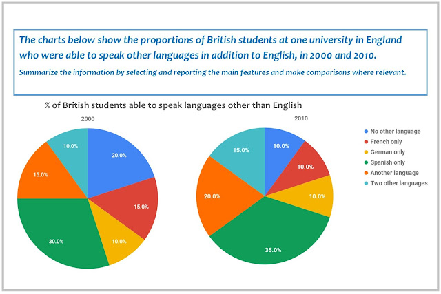
And what about pie charts? IELTS line graphs are easy to tame - you just go chronologically, so the description doesn't get out of hand. Information in pie charts, however, can be hard to organize because there are different directions you can go in. Find out how to tame your pie charts in this post: "How to tame your pie charts."


This comment has been removed by a blog administrator.
ReplyDelete